")
Have you ever tried to shop online or find a local service on your phone, only to be met with a website that loads at a snail’s speed? The layout may be clunky, images were stretched awkwardly, and the buttons seemed misaligned. But then you switch to the desktop view, and it works fine.
Frustrating, isn’t it? Now, think about potential customers facing the same issues on your site.
Most visitors may not bother switching to desktop mode if your website is not optimized for mobile use. Instead, they’ll leave for a competitor’s mobile-friendly site that’s fast, sharp, and easy to use. In addition to losing sales, you increase your bounce rate, which also affects your online visibility.
If you have a business website and care about your online visibility, you must invest in mobile search engine optimization.
What is Mobile SEO?
Mobile SEO is search engine optimization specifically targeted at mobile devices like smartphones and tablets. It’s the process of optimizing your website to rank high on Google and other search engine result pages.
This entails making your website easy to find and tailoring its content to match the search behaviors of mobile users. Think keyword and voice search optimization and the use of location-based queries.
Mobile SEO also ensures your website provides an excellent user experience. This involves everything from faster load times to responsive design that’s easy to navigate on a smaller screen.
With 63% of web traffic coming from mobile devices and Google prioritizing mobile-first indexing, your online visibility largely depends on how well your site performs on smaller screens. If your site struggles on mobile, you could be turning away potential customers before they even get to know you.
Why Mobile SEO Matters for Local Business
Here are key reasons why mobile SEO is essential for the success of your local business.
- Increased Mobile Searches: Google’s data show that 64.27% of global web searches come from mobile as of December 2024. This number will continue to grow as more people access mobile devices. Moreso, “open now near me” searches have grown by over 400% in recent years. This means potential customers are looking for products or services near them while on the go. Without mobile optimization, you’re missing out on a huge chunk of potential traffic.
- Google’s Mobile-First Indexing: Google’s shift to mobile-first indexing means that it primarily evaluates the mobile version of your site when determining search rankings. Even if your desktop site is flawless, a poorly optimized mobile version can hurt your overall SEO performance. For local businesses, this could mean the difference between appearing on the first page of search results and being buried where no one looks.
- Voice Search Compatibility: Search engines like Google have advanced voice search capabilities. About 30% of users between the ages of 16 and 65 use voice search daily for local searches. Optimizing for mobile SEO ensures your site appears for these spoken searches.
- Higher Conversion Rates: Users who search for a nearby service visit a physical business within a day. 56% of in-store shoppers made purchases through their smartphones. So, even if your business has a lot of foot traffic, having a mobile-friendly site is one great way to increase your conversion rates.
Optimizing your site for mobile SEO puts your business in front of a growing pool of mobile users ready to buy.
Also, an effective strategy doesn’t just boost your local visibility. It also enables businesses to expand their services digitally. For instance, local gyms or coaching centers can use an online course creator to build and offer online classes. This ensures their services are accessible anytime, anywhere, and by more people.
So, let’s discuss the best practices for mobile search engine optimization next.
5 Mobile SEO Best Practices
Regarding mobile local SEO, businesses encounter a unique set of challenges that can impact their online presence. With mobile searches becoming the norm, local businesses need to make sure their websites are not just mobile-friendly but also optimized for the fast-paced, on-the-go behavior of users. Let’s take a closer look at some of the key challenges businesses often run into.
Here’s a list of five best practices to ensure your website is fully optimized for mobile users.
1. Use a Responsive Design
Nothing frustrates users faster than struggling to navigate a clunky website.
Responsive designs fix issues like oversized images, tiny buttons, or text that’s impossible to read without zooming. It ensures your website adjusts seamlessly to any screen size, be it a phone, tablet, or desktop, without breaking functionality.
Avoid elements like pop-ups or unclickable buttons that frustrate users. Simplify the user interface for mobile by prioritizing collapsible menus and touch-friendly buttons and keep call-to-action elements within easy reach.
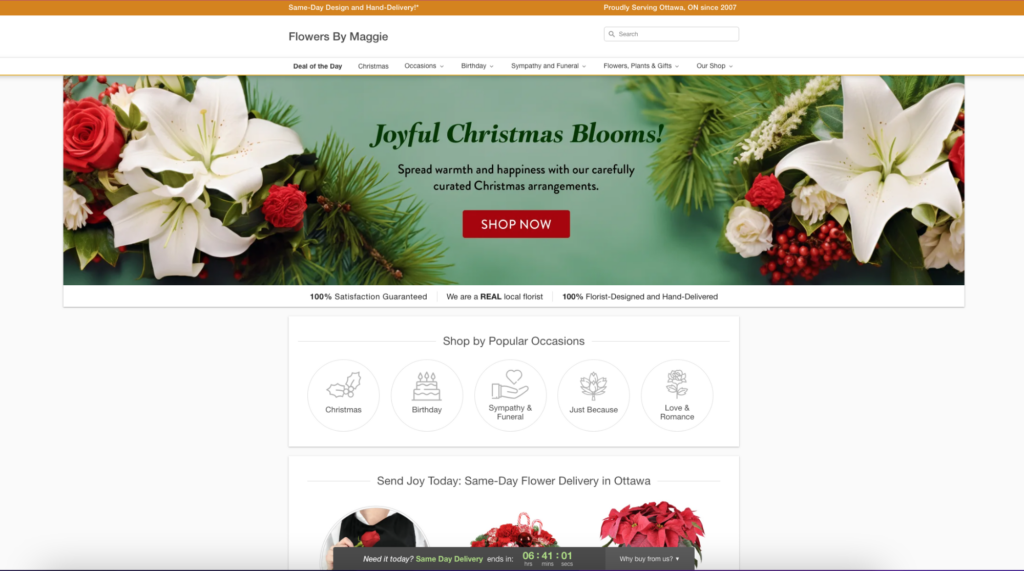
See how this website, Flowers by Maggie, looks on mobile and desktop devices. The layouts are different on each device but still intuitive.
 Desktop View
Keep in mind that the user experience affects SEO. A mobile-friendly website keeps users on the site, which reduces bounce rates. This sends positive signals to Google, helping you rank better.
Use Google’s Lighthouse tool to evaluate your site’s mobile usability. For deeper insights, try Google’s Rich Results Test to see how your site renders as a mobile bot. Both tools provide actionable data to guide your improvements.
If your site struggles with responsiveness, platforms like WordPress and Wix offer templates designed specifically for mobile optimization.
2. Enhance Page Speed
Page speed is super critical for mobile users because they might have slower internet speeds. Also, mobile users are more susceptible to distractions from other apps on their gadgets. The longer your site takes to load, the higher the chances a user will pulled away by something else.
Also, 53% of mobile users abandon a mobile site if it takes longer than three seconds to load.
To improve speed, start with the basics:
- Compress images using tools like TinyPNG.
- Minify CSS and JavaScript to eliminate unnecessary code.
- Implement browser caching and reduce redirects.
- Use a Content Delivery Network (CDN) to distribute content more efficiently.
Use tools like GTmetrix or Pingdom to analyze your mobile site’s speed. Google’s PageSpeed Insights also provides actionable insights into your site’s performance across devices. It measures key metrics, such as the Largest Contentful Paint (LCP) and Time to First Byte (TTFB), which affect both speed and user experience.
To ensure a smooth user experience, aim for an LCP of 2.5 seconds or less. Ensure that at least 75% of your page loads meet this target on both mobile and desktop.
3. Incorporate Geo-Specific Keywords
Local businesses thrive on location-based searches. Geo-targeted keywords help search engines understand where your business operates and what services you provide.
Effective geo-targeting involves weaving names of cities or neighborhoods into your blog content, service descriptions, titles, and metadata in a way that feels natural and relevant to users. You can also create a Google My Business or local listing profile with these local keywords and update it regularly to maintain accurate business details.
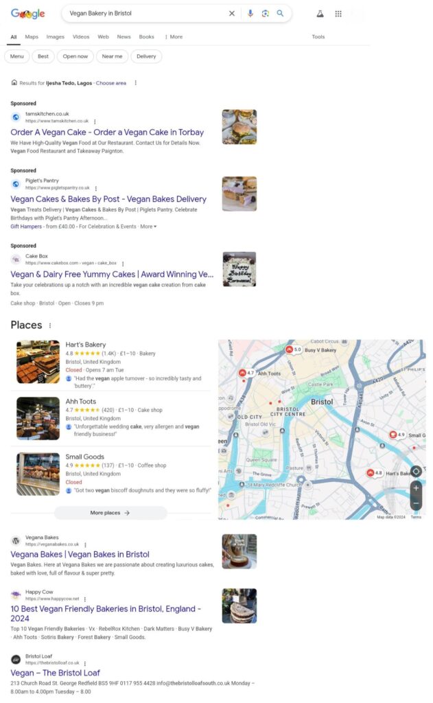
Check this search result page for ‘vegan bakery in Bristol.’ You will notice all the businesses showing up here have used geo-specific keywords on their web pages and metadata.
If you run a multi-location business or want to rank for more geo-specific keywords, you can create a personalized landing page for each location. For example, a bakery that makes gluten-free desserts in Bristol can also target neighboring towns like Mendip Hill and Castle Combe.
However, not all keywords are worth targeting. Use Google Search Console, Semrush, Moz, and other SEO tools to identify high-value, location-focused keywords that can boost your local SEO efforts.
4. Optimize for Voice Search
With the rise of smart assistants like Siri, Alexa, and Google Assistant, voice search is becoming a major player in how users find local businesses. Mobile SEO ensures your business is optimized to capitalize on this growing trend.
To optimize for voice search, focus on long-tail keywords and natural language. Google, for example, readily gives you pointers to these long-tail keywords with autocomplete while you type a search. You can also find relevant long-tail keywords in the ‘People Also Ask’ section on a result page.
Structure your content to address common questions related to your topic directly. For example, a local gym might target queries like, “What are the benefits of yoga for beginners?” and provide detailed NLP-friendly answers.
Use frequently asked questions on search engines such as H2s or H3s within your content. This can increase the visibility of your content for voice searches. You can also create a dedicated FAQ section at the end of your articles to address additional queries.
Integrating FAQ schema into your site also helps search engines understand and prioritize your content for voice results.
Pro tip: Use tools like AnswerThePublic to identify common questions users ask related to your product offerings. Write content that answers these questions directly, keeping your tone conversational.

5. Implement Schema Markup
Schema markup helps search engines understand your content better. It also allows Google to display rich snippets like business hours, customer reviews, and locations directly in search results.
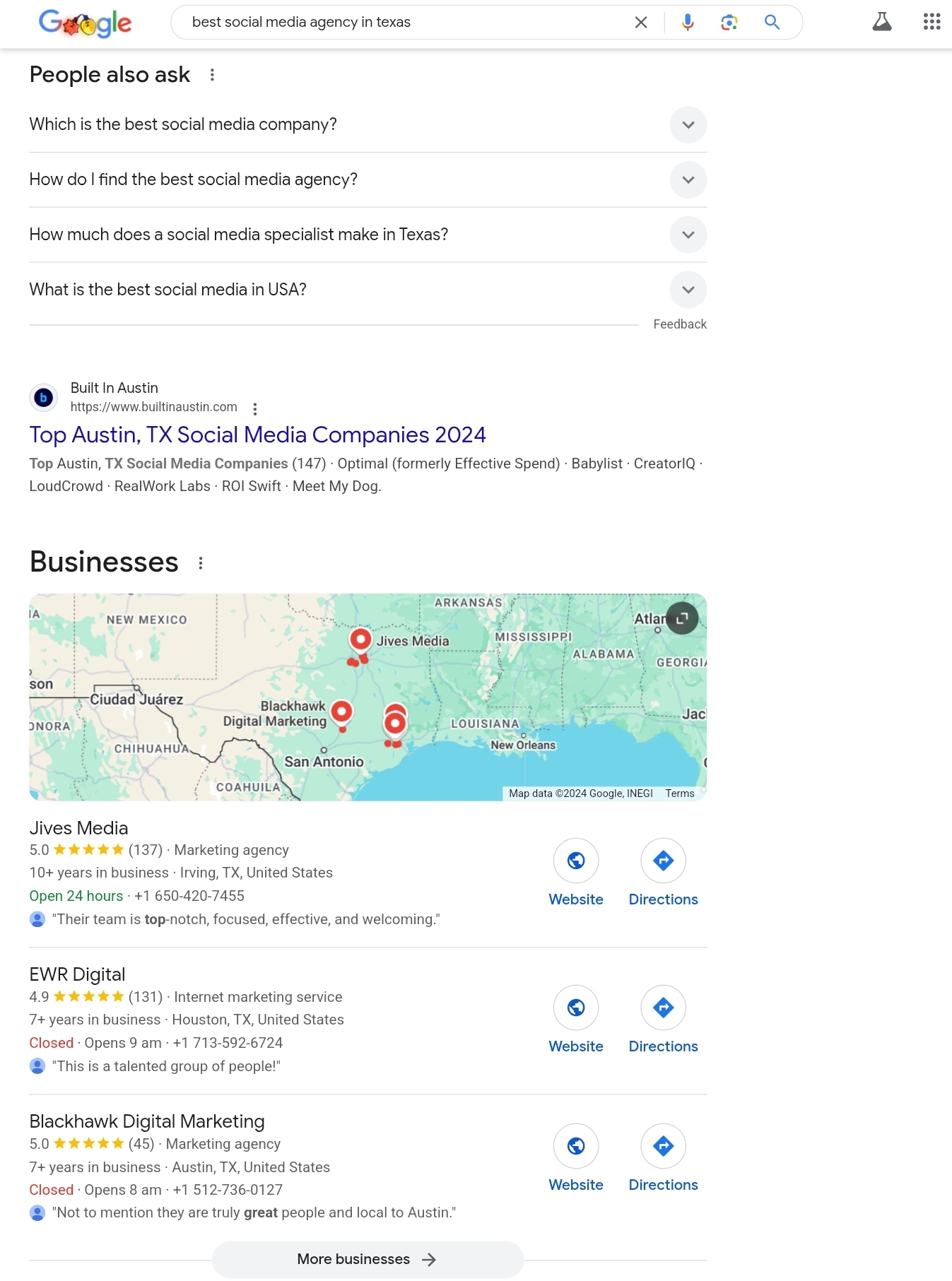
Here is an example from the voice search we did above.
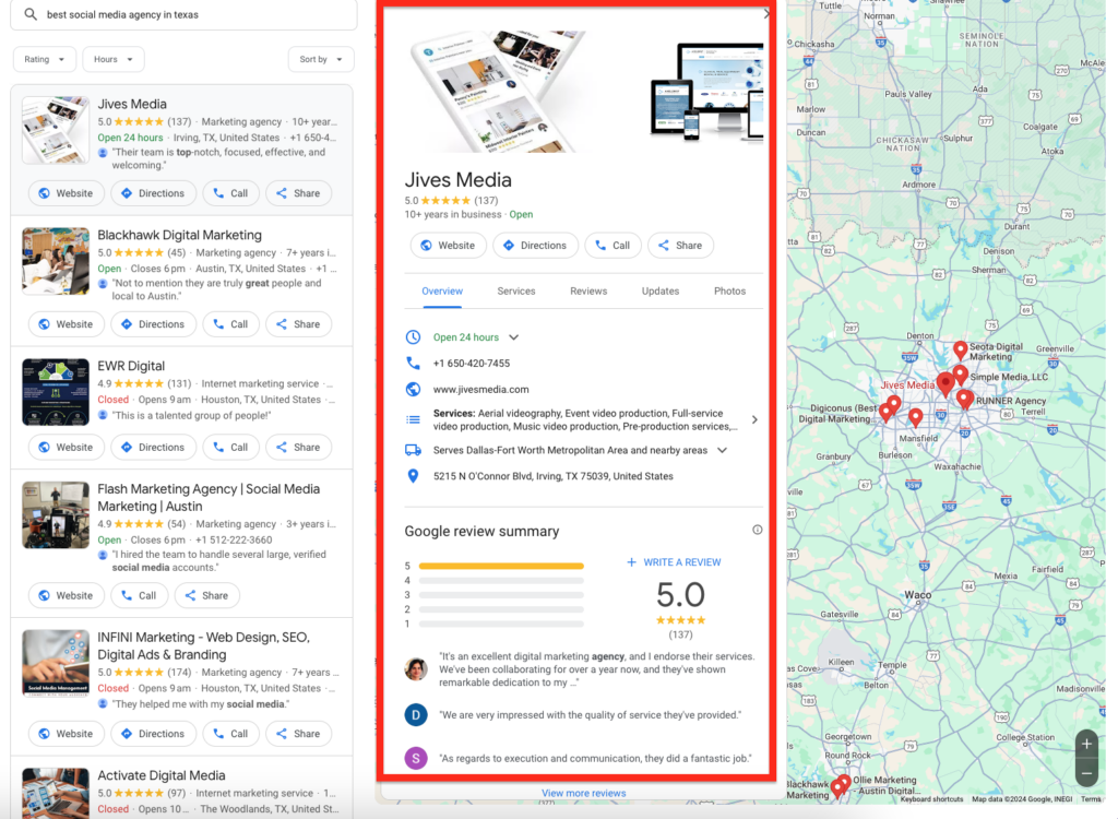
These enhanced listings give searchers critical details of your business at first glance without having to visit your site.
Use Google’s structured data markup helper to create schema tags for your website. Focus on key details like your business name, address, phone number, and reviews. This enhances your search presence and provides relevant details directly to potential customers.
Validate your schema using Google’s Rich Results Test to ensure it works correctly.
Common mistakes to avoid
❌Ignoring Mobile-First Indexing
Google now prioritizes the mobile version of your site when determining your rankings. If your mobile site feels like an afterthought, is slow to load, or is missing content, you’re not just hurting your rankings; you’re driving potential customers away. Make your mobile site as polished and functional as your desktop version. For many users, it’s their first (and sometimes the only) impression of your business.
❌Poor Image Optimization for Mobile
Oversized, uncompressed images are a mobile site’s worst enemy. They can slow down your load times and frustrate users who expect instant access. Compress your images, use responsive formats like WebP, and add descriptive alt text to improve both loading speed and accessibility. Remember, fast-loading images don’t just please visitors, they also keep Google happy.
❌Overloading with Pop-Ups on Mobile Screens
Nobody likes landing on a site only to be greeted by a pop-up that blocks all the content. Not only is it frustrating for users, but Google also penalizes sites with intrusive interstitials. If you rely on pop-ups, make them subtle and non-intrusive, like a small banner at the bottom of the screen. Always prioritize a smooth user experience over aggressive promotions.
❌Forgetting About Voice Search Optimization
Voice search is on the rise, especially for local queries like “best coffee shop nearby” or “cheap car wash near me.” If your site isn’t optimized for conversational, question-based searches, you’re missing out. Use natural language and long-tail keywords to align with how people speak. Adding an FAQ section to your site is a simple way to cater to voice search users while improving overall SEO.
❌Neglecting to Test Your Site on Real Devices
Testing your site on one device or browser isn’t enough. Your customers use a mix of smartphones, tablets, and older devices that might not support the latest features. Without testing on real devices, you could miss issues like awkward layouts, buttons that are hard to tap, or forms that don’t work. Take the time to test your site across various devices and screen sizes to ensure a seamless experience everywhere.
Conclusion
The success of your local business depends on being found where it matters most: in front of mobile users. This makes mobile SEO non-negotiable.
Implement a responsive design, speed up your site, optimize for voice search, and leverage schema markup to boost mobile user experience and improve your SEO rankings.
You can use Google developer tools, as well as local SEO and heatmap tools, to track performance, identify opportunities, and refine your strategy for optimal local SEO results.
Your customers are already searching. Your customers are already searching. Make it easy for them to find and choose you by turning your website into a mobile-friendly storefront that drives sales. It’s a simple step that can make a big difference.
FAQs: The Ultimate Guide to Mobile SEO for Local Businesses Websites
How to do SEO for a local business?
Start by optimizing your Google Business Profile, adding relevant keywords to your website, and ensuring your business details (like name, address, and phone number) are consistent across all online listings. Local reviews and location-based content also help a lot.
What is the importance of a mobile-friendly website for local SEO?
A mobile-friendly website ensures visitors have a smooth experience, which search engines prioritize. Since most local searches happen on mobile, it’s key to ranking higher and keeping potential customers engaged.
How does mobile search influence local SEO?
Mobile searches often come with intent like “near me” queries, making them a big driver of local traffic. If your site is optimized for mobile, you’re more likely to show up in results and attract ready-to-act customers.
Can I do SEO on mobile?
Yes, you can handle many SEO tasks on mobile, like checking analytics, managing your Google Business Profile, and even optimizing content with mobile-friendly tools. Apps make staying on top of SEO easier, even on the go.


