If you run an agency, your marketing agency website can either be your best salesperson or your weakest link. It’s what prospective clients judge before they ever hop on a call. And in a space where everyone claims to be “creative” or “data-driven,” your website is often the only thing that shows whether you actually are.
The best marketing agency websites don’t only look visually great. It’s not just about having the fanciest animation or trendiest gradient. They pull prospects in and make it ridiculously easy to take the next step.
In this article, we’ll show you what we consider the best marketing agency website templates you can take inspiration from. But first, let’s see the essentials to start with.
TL;DR: Marketing Agency Websites to Get You Inspired
- A great marketing agency website tells visitors who you are, what you do, and why you’re worth their time.
- The best marketing agency website mixes clean layouts, simple words, and strong proof. They include clear service pages, strong calls to action, and results that don’t sound exaggerated.
- Minimalist sites keep things sleek and professional with no visual clutter but straight-up value and proof of skill.
- Creative agencies use design like a storybook. Visitors scroll because it feels fun and is never forced.
- Performance-led sites can use real numbers, a clean structure, and clear ROI to speak to business-minded decision-makers.
- Niche pros demonstrate that delving deeply into a specific area (such as SaaS) earns more trust than trying to please everyone.
- When designing, focus on people first. Keep navigation simple, make content easy to skim, and make every click feel intentional.
- A properly built custom site (good UX, custom dev, smart copy) usually runs between $8k–$20k; it’s worth every cent if it consistently brings in leads.
The Essential Elements of a High-Converting Agency Website
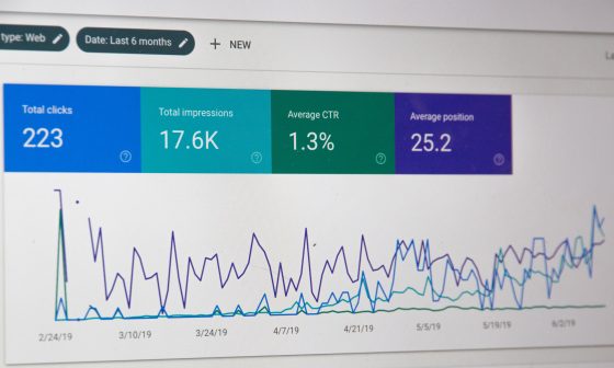
According to data from 205,873 websites, you have just 10 to 20 seconds to make your website clear and relevant to your target audience.
That’s how long the average user spends deciding whether to stay or leave. Most of them don’t care about your awards; they want to know, right off the bat:
- What do you do?
- Who do you help?
- Can you be trusted?
Get those three things right, and everything else (your portfolio, visuals, CTAs) will do its job correctly.
1. A Clear & Compelling Unique Selling Proposition (USP)
If your homepage headline says something vague and hyperbolic like “We build experiences that inspire”, you need a rewrite. That could describe any agency on the planet. Your USP should spell out exactly what you do and who benefits from it.
Let’s say you’re a boutique growth agency. A better USP might read:
“We help eCommerce brands turn browsers into buyers through CRO and performance content.”
That’s short, specific, and outcome-driven.
If you run a performance agency, redoing your hero section from “We make brands grow” to something like:
“We’ve helped 25 retailers increase online sales by an average of 37%.”
This can instantly make your click-through rates jump considerably. It’s the same offer but with different clarity.
Make your USP bold, above the fold, and backed by one real metric. You can even add a short subline like “Backed by Google Partner status” or “Serving 120+ local businesses.”
2. Showcase Your Expertise (Services & Portfolio)
The next thing visitors check is whether you can do what you claim. This is where your service pages and portfolio carry the load.
So, break your services down by benefit. Instead of listing “SEO,” write “Get your business found where people are already looking.” Add a single stat or tool mention for authority, i.e., “We use GA4 and Search Console to track every click.”
Then, add mini-proofs. You don’t need huge case studies; even three short wins with measurable results can do the trick. For example:
- “Helped a regional gym chain cut ad waste by 31%.”
- “Doubled web traffic for a SaaS startup in 60 days.”
- “Brought 400 new leads in a quarter for a small clinic.”
Quite a lot of B2B buyers rely on case studies and data-backed examples before contacting an agency. So, if you’re not showing outcomes, you’re forcing people to trust you blindly.
3. Build Trust with Social Proof
People don’t buy from strangers; they buy from proof. And nothing screams “trustworthy” like real client feedback, consistent reviews, and recognizable logos.
The trick isn’t adding a generic carousel of five-star quotes. It’s showing believable, bite-sized proof. For instance:
- A testimonial that mentions the problem and result: “Our Google Ads were bleeding cash. These guys brought down our CPA by 40% in two months.”
- Review metrics: “Rated 4.9★ on Clutch by 63 verified clients.”
- Industry affiliations: Google Partner, Meta Business Partner, or local chamber memberships.
Now, here’s something many agency owners forget: fast, simple sites build trust too.
Over-animated sites often lose small-business leads because they load slowly and confuse users.
The numbers tell the story: websites that load in just 1 second convert up to 5 times better than those that take 10 seconds. That eye-catching video background might actually be costing you leads. If you really want to use one, make sure to test its load time.
Quick Tip: Displaying verified client reviews on your agency website builds instant trust. With Synup Review Widgets, you can showcase them seamlessly without affecting your site’s speed.
4. Clear & Strategic Calls-to-Action (CTAs)
A strong digital marketing agency website doesn’t leave visitors guessing what to do next. Every page should naturally lead to a single action.
Your CTAs should align with where your visitor is in their decision-making journey.
- Early stage: “Get our 2025 marketing playbook” or “Download our free audit template.”
- Mid stage: “See how we grew a fitness brand’s revenue by 50%.”
- Ready to talk: “Book a 20-minute discovery call.”
Don’t bury your CTA under clutter or fancy animations. Users should see it within the first screen and again before they leave the page.
Also, tone matters. Nobody likes “Submit form.” Instead, write like a human:
- “Let’s plan your next campaign.”
- “Get free strategy ideas.”
- “Talk to a real marketer today.”
Small tweaks like this make you sound approachable, not robotic.
10+ Marketing Agency Website Templates to Get You Inspired
The best marketing agency websites show expertise, build trust, and nudge visitors toward action without the fluff. Below are 11 real-world examples, grouped by design style, with page-level breakdowns, features, and lessons you can actually apply to improve your own site.
Minimalist & Modern
1. Olivine: Product Marketing Agency (B2B SaaS)
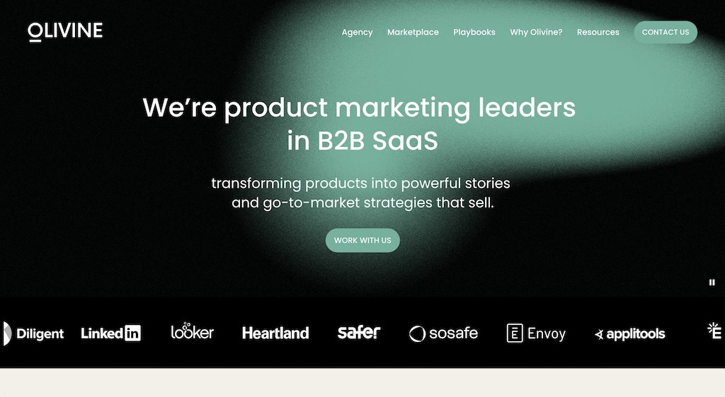
Source: Olivine
Homepage
Olivine hits you right away, first, with service offer clarity: “We’re product-marketing leaders in B2B SaaS, transforming products into powerful stories and go-to-market strategies that sell.”
Those lines communicate audience, service, and value instantly. The hero section uses muted colors, minimal motion, and light space that highlights the message.
Services Page
Divided into three crystal-clear sections: Agency, Marketplace, and Playbooks. Each section has a two-line summary, a short visual, and a “Contact Us” CTA. Visitors can easily identify what they need, whether it’s long-term support, one-time consulting, or ready-to-use frameworks.
About/Portfolio Pages
Olivine positions itself as a “collective” of senior-level experts and not a traditional agency team. They highlight real credentials from ex-Intercom, Sauce Labs, and Mixpanel product marketers. This gives visitors an immediate sense of credibility.
2. Graphite: AI-Powered Growth Team
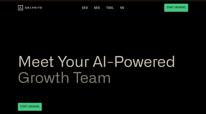
Homepage
Graphite greets you with “Meet Your AI-Powered Growth Team.” The subhead promises “Full-stack growth across SEO, AEO, and content” with no fluff or copywriting filler.
Further down is a bold, captivating statement: “95% of SEO work is waste. 5% of work drives all the impact.”
Services/Features Page
In the menu page, they actually kick it up a notch and challenge an industry belief: the 5% concept.
This positioning appeals to marketing leaders tired of outdated tactics. Each service block includes icons, one-sentence definitions, and proof metrics (e.g., “4x faster output,” “real-time keyword clustering”).
About/Trust Page
Includes recognizable names such as MasterClass, BetterUp, and Robinhood, all displayed in grayscale for a sophisticated look. There’s no overuse of animation; it’s calm and confident.
Bold & Creative
3. Beans Agency: “Infinite-Scroll” Portfolio Energy
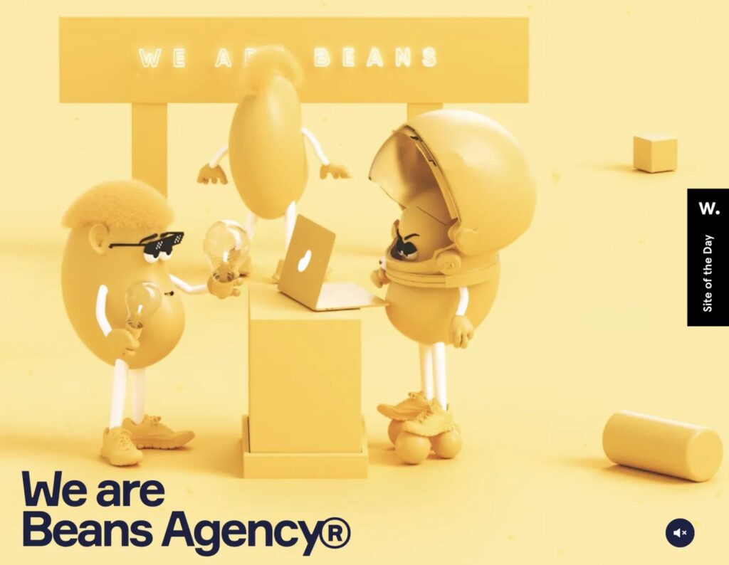
Homepage
Beans is a Ukrainian agency that skips the conventional header-menu combo and goes full storytelling mode. Its infinite scroll layout feels like a motion reel: as you scroll, sections transform into different projects. The palette is colorful, almost neon-inspired, reflecting their playful branding.
The scrolling experience doubles as a sales pitch; it keeps users longer on-site (average session duration is notably higher for scroll storytelling sites).
Work Page
Each project expands on hover, revealing campaign visuals, typography, and palette breakdowns. The transitions are fluid with zero jarring page loads.
4. Lusion: Real-Time, Interactive Storytelling
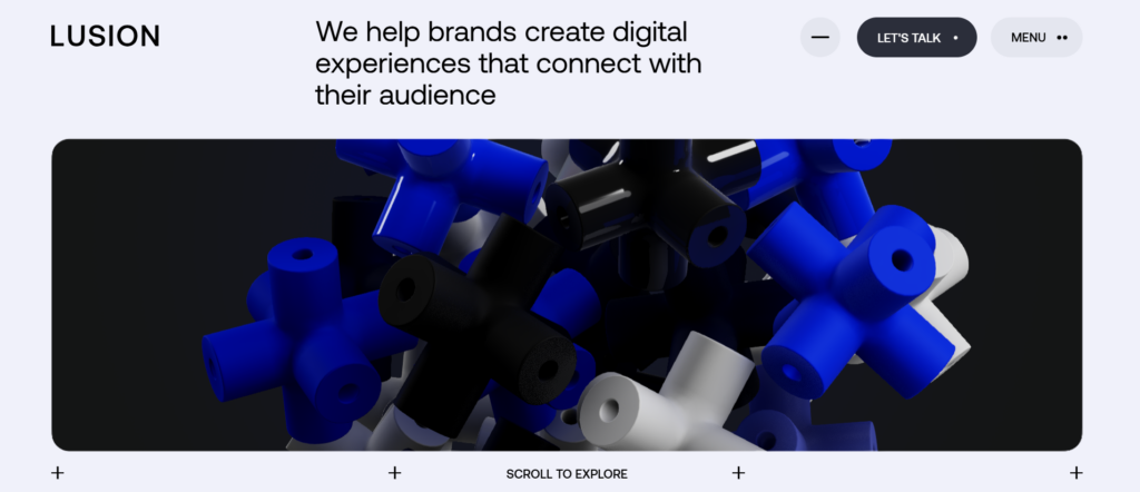
Source: Lusion
Homepage
Lusion offers instant visual spectacle with a real-time 3D landscape that reacts to the visitor’s cursor. After a few minutes of exploring, it starts to feel almost like a game, giving prospective clients an instant sense of what to expect and drawing them in right away. The 3D visuals, storytelling scroll experience, homepage copies, and hero text make the services offered crystal clear.
Everything on the page feels alive without tipping into the “sensory overload” category.
Projects Page
A grid of thumbnails representing interactive builds, each opening into mini-case pages that autoplay animations.
About Page
The About page explains the agency’s blend of art and technology: “We are Lusion. A creative production studio.”
Despite heavy visuals, Lusion’s code optimization keeps load times at around 488 milliseconds (4.8 seconds), proving that creativity and performance can coexist (the load page also has a dynamic animation, keeping visitors on the page).
5. That Lot: Social-First Creativity With Proof
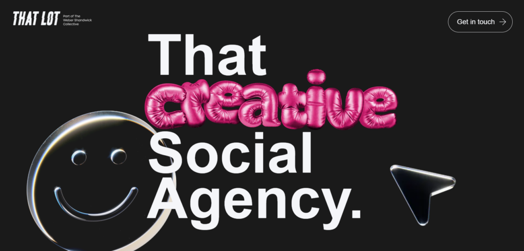
Homepage
That Lot introduces itself with confidence: “That Creative Social Agency.” The word “creative” comes alive the moment you land on the site, proving their tagline before they even say another word.
The following line, “We make brands unskippable,” comes with the benefit promise with no buzzwords. It’s direct, emotional, and native to social media. The design uses looping short videos that mirror the energy of TikTok or Reels.
Case Studies
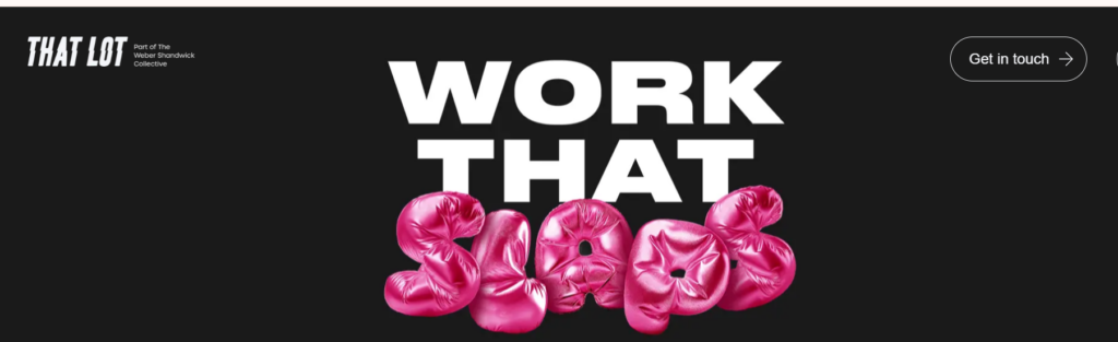
The Our Work page opens with a creative heading, “Work that Slaps,” and showcases work for brands like Spotify and Greggs, but focuses on impact.
Tone feels confident but relatable, making them feel approachable to both startups and large brands. The “Weber Shandwick Collective” mention adds enterprise-level credibility.
About Page
The About page is human-focused, full of team headshots, creative roles, and studio life snippets. This gives warmth to an otherwise enterprise-ready agency.
Data-Driven & Professional
6. Ladder: Full-Funnel, Test-and-Learn Engine
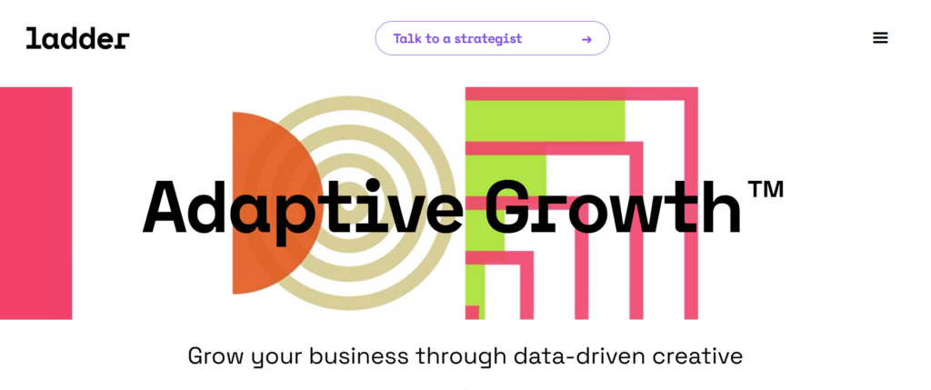
Homepage
Ladder is a full-funnel test-and-learn agency that starts its homepage with its biggest USP: “adaptive growth,” for which it owns a trademark.
The trademarked positioning instantly sets them apart. It signals proprietary methodology rather than generic marketing talk. Clients perceive it as a unique process they can’t easily find elsewhere.
Next, a simple tagline serves as an explainer: “Grow your business through data-driven creative.”
And just above is a CTA: “Talk to a strategist.” We like how the homepage hierarchy follows a logical cognitive flow. USP > explainer > CTA. This layout mirrors how users scan (attention, understanding, then action), making conversion frictionless.
Team/Mission
Positions data-driven creative testing as their competitive moat, supported by real examples.
Clean structure reflects the test-and-learn philosophy itself. Nothing on the page feels ornamental; every section proves its point that effective marketing is about iteration, clarity, and proof.
7. Wpromote: Challenger Brand Positioning & Full-Funnel Credibility
Source: WPromote
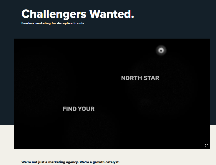
Homepage
Leads with the bold headline “Challengers Wanted”, setting a clear tone for the kind of brands they partner with; that is, the ambitious and disruptive. The subtext, “Fearless marketing for disruptive brands,” doubles down on that identity.
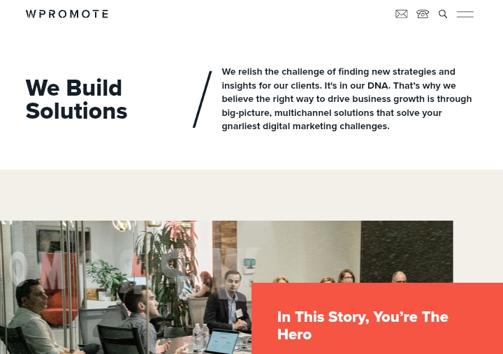
Directly beneath, the agency reframes itself: “We’re not just a marketing agency. We’re a growth catalyst,” and explains its strategy-led, data-powered approach. Three pillars (Media with Momentum, Hybrid Intelligence, and Outcomes That Matter) summarize their full-funnel service model in a single horizontal layout.
About Page
Defines the Wpromote Difference as a full-funnel independent agency founded in 2001. The copy highlights evolution, curiosity, and innovation, explaining how strategy, media, creative, and data integrate across channels.
Results Page
Titled “Marketing Results That Matter,” the page instantly focuses on proof. Each section shows measurable business impact from brand awareness to performance metrics. The layout utilizes modular case tiles (QuickBooks, Klipsch, Hibbett, Erin Condren) that open into detailed stories, including performance lift data and the tactics used.
8. Major Tom: Clarity-Driven Experience
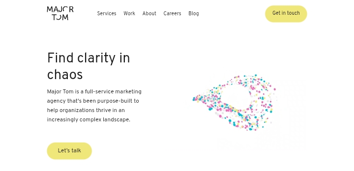
Homepage
The first thing you see is a clear, confident headline that shows exactly what Major Tom delivers: clarity in your marketing. It offers a promise that matches what clients want with less confusion and more direction. The 3D-style dashboard graphic beside it isn’t there for show. It visualizes how data and design work hand in hand. The yellow “Let’s Chat” button pops against the calm background, making it easy for anyone ready to talk business.
Services Page
This page is structured for people who don’t have time to dig around. It opens with a short intro about how real growth happens when strategy, creative, and development work together, not in silos.
Then, a clean two-column list breaks down their capabilities: Digital Strategy, SEO, Brand Strategy, eCommerce Development, Shopify Plus, WordPress, Custom Web Development, UX/UI Design, HubSpot Consulting, and more. You can tell they’ve thought through how CMOs, marketing leads, and business owners scan a page.
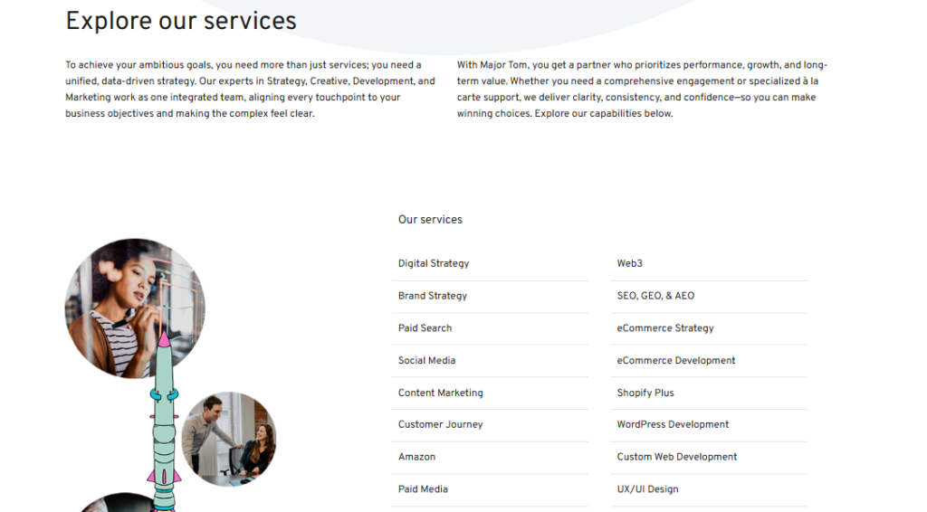
Mentions of tools like Shopify Plus, WordPress, and Klaviyo quietly show they know their way around complex builds. It’s well-balanced for creative and tech buyers. Whether you’re a marketing lead looking for growth or a dev-minded exec checking backend capabilities, the message lands right.
Niche-Specific (Content/SaaS)
9. Minuttia: Adaptive Content Marketing
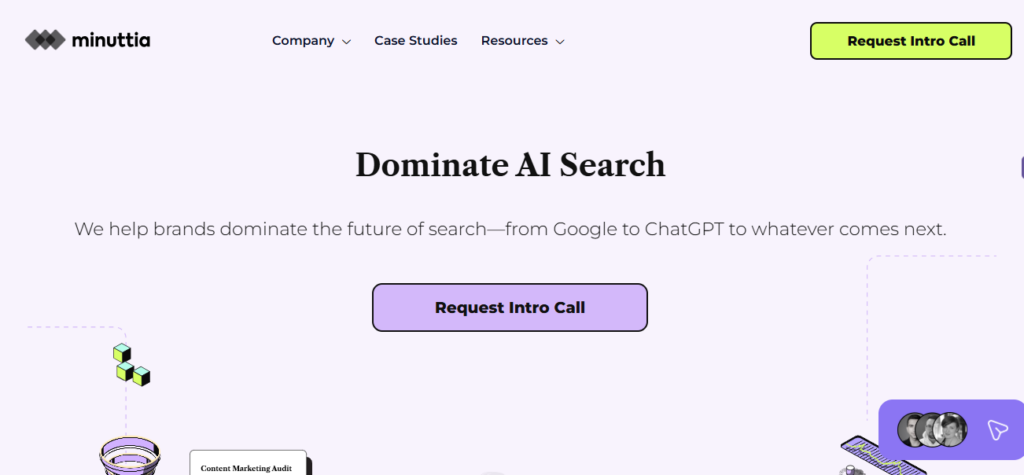
Homepage
Minuttia wastes no time explaining who they serve. That single line tells you the audience (established brands), what they do (content marketing), and how (strategic playbook). The layout uses clean lavender tones and sharp typography, paired with visuals of content funnels, keyword data, and revenue graphs, a familiar language for SaaS marketers and founders.
Who We Serve Page
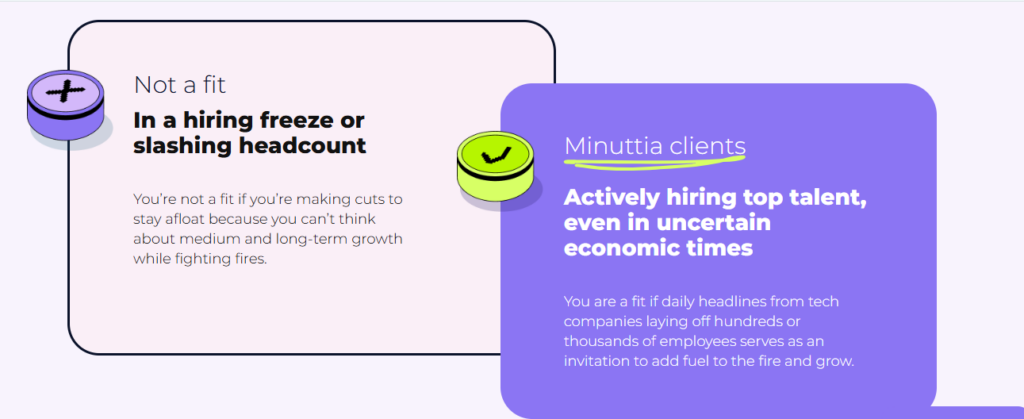
Minuttia distinguishes itself with a clear “Not a Fit / Minuttia Clients” comparison that both inspires and reinforces the agency’s wins. It’s effective because it delivers a lot of detailed information at once, clarifying the agency’s typical services without meaningless bloat while uplifting their work and subtly calling out bad practices. As you scroll through, Minuttia positions itself as a natural choice for clients who want to get things done, and honestly, that’s the right kind of crowd to attract.
10. Animalz: Content & SEO for Leading B2B SaaS
Homepage
Animalz leads with confidence. The headline sits over a clean white background, paired with subtle mascot illustrations that make the brand instantly recognizable. The page uses trust anchors like client names, social proof, and a clear CTA. This positioning is sharp and clear: high-end content and SEO for growing SaaS brands.
About Page
The About page humanizes the brand. It introduces their story, how a small NYC team turned a global content powerhouse. You’ll find proof points like 500+ customers served, 10 years in business, and 7 industry specializations.
11. Dofollow: Link-Building Specialists
Homepage
Dofollow doesn’t waste words. The subheader, headline, and hero copy say it all. The purple-and-gold palette gives it a sharp, “tech-meets-premium” vibe. Their message is straightforward. They help B2B SaaS brands earn high-authority backlinks that move the SEO needle. The “Request Pricing” button is hard to miss, sitting right in the hero for instant conversion.
Services Section
Everything’s well explained. They build backlinks from DA 70–90+ domains, monitor live links, and even replace broken links for free. The visuals (graphs, dashboards, DR scores) reinforce credibility without feeling salesy.
Best Practices for Designing & Building Your Site
Now that you have enough creative fodder to chew on, let’s run through some general best practices that are sure to get you a win:
Prioritize User Experience (UX)
Think of UX as the wiring under your digital roof. If it’s messy, even a beautiful site will fall apart. Your visitors should never wonder what to click next.
Start with a simple sitemap. Before your designer opens Figma, sketch out a flow: Homepage > Services > Work > About > Contact.
It’s also essential to make sure your website works seamlessly on mobile. This improves accessibility and supports your core goals of visibility, engagement, and conversion. Always test your layout on different screen sizes to ensure your design looks and performs well everywhere.
Begin with a Color Scheme That Speaks to You
When used thoughtfully, color can blanket your content in meaning, adding depth instead of distraction. Choose a palette that embodies your brand and highlights the messages you want to stand out.
A limited color scheme can help focus attention on key details, while a broader palette can showcase your energy and creativity. Let your colors and branding hint at the quality and personality of your work. Plain primary colors and black text on white backgrounds often signal blandness, and that’s not what your agency stands for.
Ensure Fast Loading Speeds
Performance isn’t a design add-on but the backbone of every good site. On a custom build, speed starts in the planning phase, not the hosting settings.
When you work with developers, ask about minification, lazy loading, and server-side rendering. These simply help your site load what matters first, and everything else catches up later. One of the easiest real-world wins is using SVG graphics instead of heavy PNGs or GIFs. Another is trimming plugin clutter if you’re on a CMS.
Use Professional Photography & Visuals
A templated site often feels generic because it leans on the same stock smiles, office scenes, and handshake photos everyone else uses.
If you’re serious about standing out, invest in a half-day brand shoot. Capture your team in action, your workspace, and the tools that bring your ideas to life.
Optimize for SEO and Performance Together
It might be time to turn the SEO magnifying glass on yourself. SEO should naturally be an integral part of the website development process. Every digital marketing agency website design should treat structure like scaffolding; if it’s crooked, the site can’t grow.
Start with semantic HTML tags so crawlers can “read” what each section means: <header>, <article>, <section>. A dev who codes clean markup saves you months of SEO cleanup later. Then create a content hierarchy that mirrors how people search: Service, Benefit, Proof, CTA.
For URLs, keep them short and readable. A good slug looks like “/content-strategy”, not “/services?id=12.” Include your focus keyword naturally in titles, headings, and image alt text. That’s enough. You don’t need 50 more.
Here’s a video we think you could check out: The Easy Way to Design Top Tier Websites
Also Read: How to Make Your Website More Engaging in 2025: 15 Tips
Conclusion & Next Steps
At the end of the day, the best marketing company websites work because they feel effortless. The pages flow, the visuals load instantly, and every section answers a silent question a prospect might have.
You don’t need a massive rebuild to look credible. You just need to think like that visitor who’s skimming your homepage at midnight, deciding if you’re worth a call.
FAQs
1. What makes the best marketing agency websites stand out?
The best agency websites make complex ideas feel simple. They tell you, right from the start, what they do and who they help. Within five seconds, your audience should understand your story, your offer, and why it matters to them.
2. How much does a proper custom agency site cost?
You’re looking at around $8,000 to $20,000 if you’re going for a serious setup (proper UX, tailored copy, and hand-coded front-end). That’s the sweet spot most mid-tier agencies spend. It’s not about the cheapest deal; it’s about building something solid that converts and still feels fresh a year from now.
3. Should I build one page or multiple pages for my website?
Start lean. A single-page site works great if you’ve got one service or niche focus. But once you grow (new services, more case studies, a bigger team), expand with modular sections. A flexible CMS lets you add without starting down the line.